Local Hero
Local hero is a mobile responsive website that helps people to get informed about their local representatives, contact them and take action in their community by submitting problems they encounter, that are responsibility of their local government.
Project Overview
People crave simplicity in the modern world so we decide to merge such complex themes as local activism and local government in one user friendly mobile responsive website.
My Role
UX/UI Designer
Team: 3 UX/UI Designers, 4 Developers
Timeframe: 3 weeks sprint
Tools: Figma, Sketch, Miro
Framework
Our framework is based on Lean UX , Design thinking (IBM). For each phase we planned set of tasks to guide us from defining the right problem to creating the right solution while advocating for user’s needs.
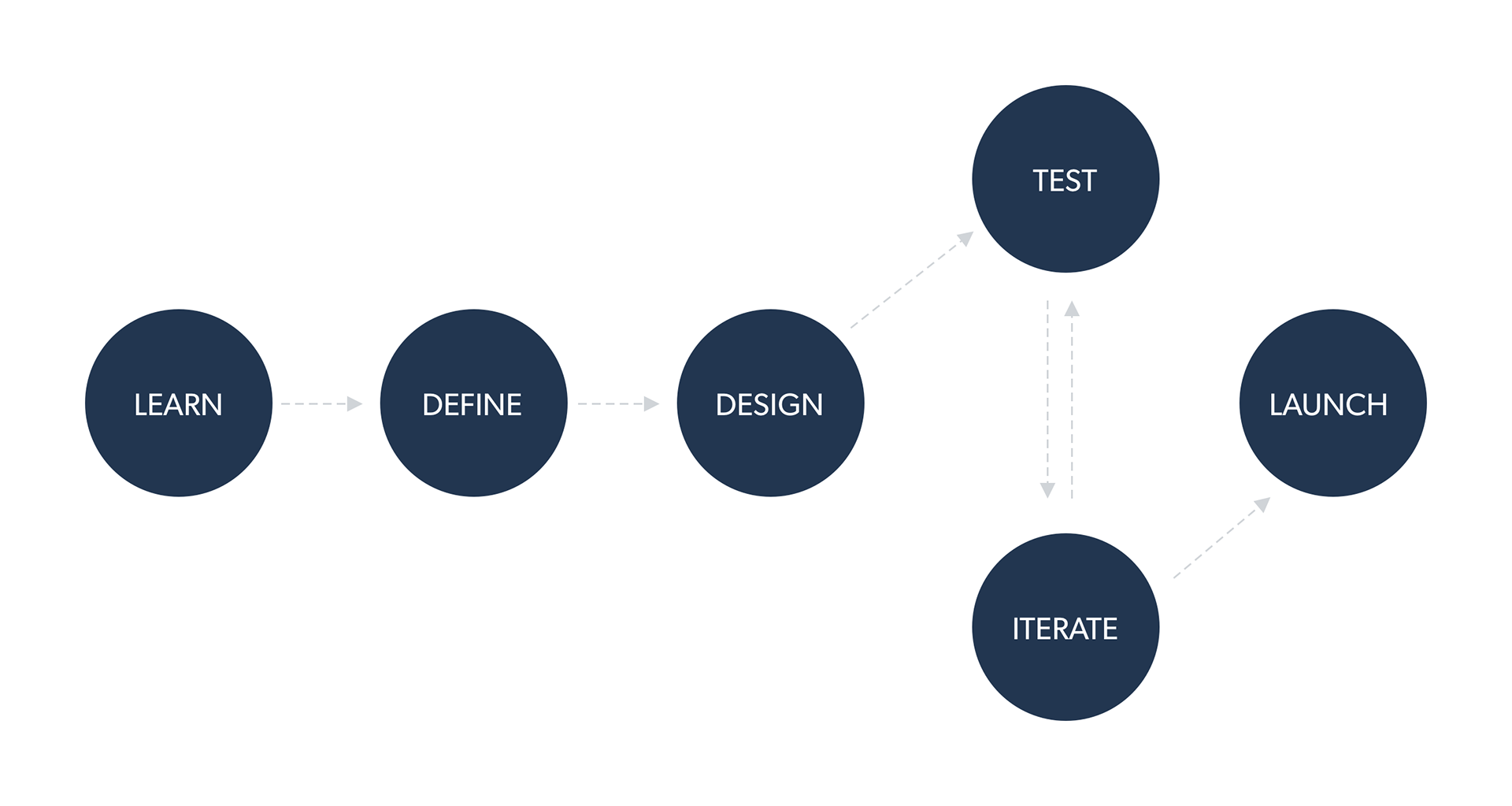
*created with Skatch
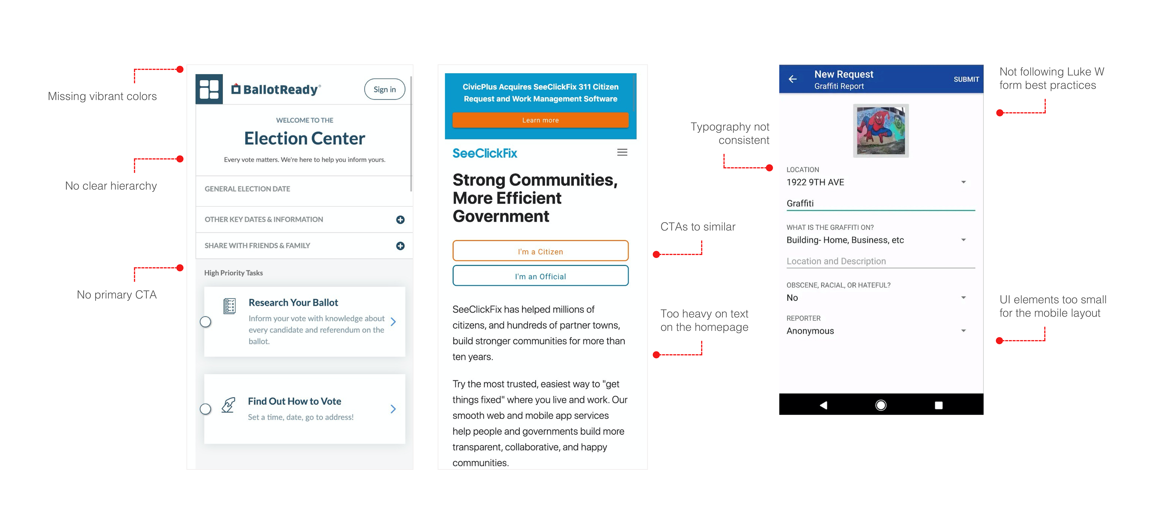
Competitive Audit & Best in Class
To get to know our market, product and understand the problem better, we looked at around 30 websites and apps in and out of our category. We found that some of them developed an elegant solution for some similar problems. We also identify some of the best practices among our competitors.

Social Listening
We got some meaningful insights by analyzing online comments and reviews on similar apps and websites. It helped us to determine what are the positive things and problems that existing apps are facing.
" 311 Is useless .."
"I don't know how high up I'll go, but how do you find those community boards ?.."
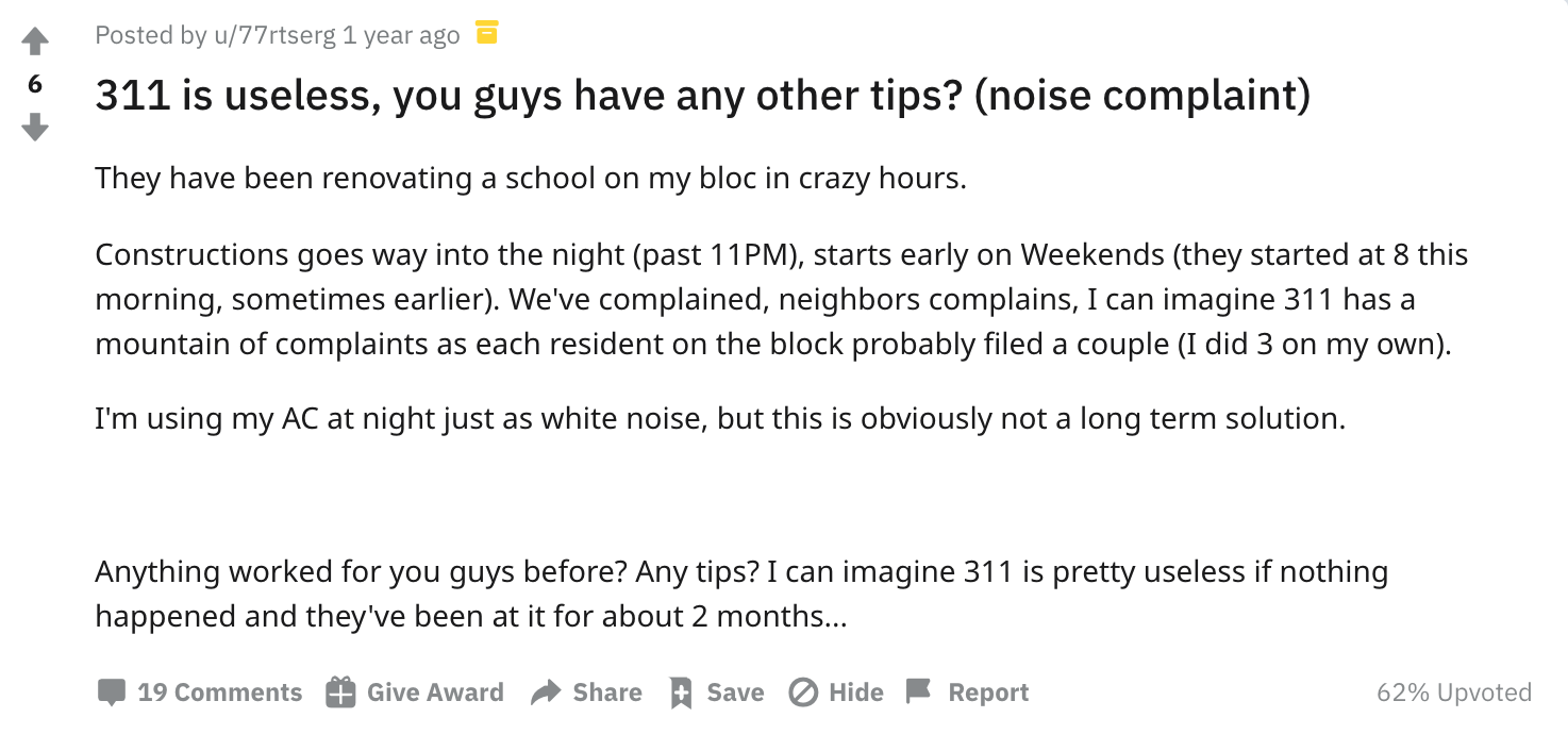

* reddit.com
1 on 1 Interviews
Are great method to ask for users’ opinions and experiences. We talked with several volunteers and most of them agreed that they would like to see and use app or mobile website that allows them to contact their local representatives and also to be able to report some issues that are existing in their neighborhood.

* Zoom interview with Jason
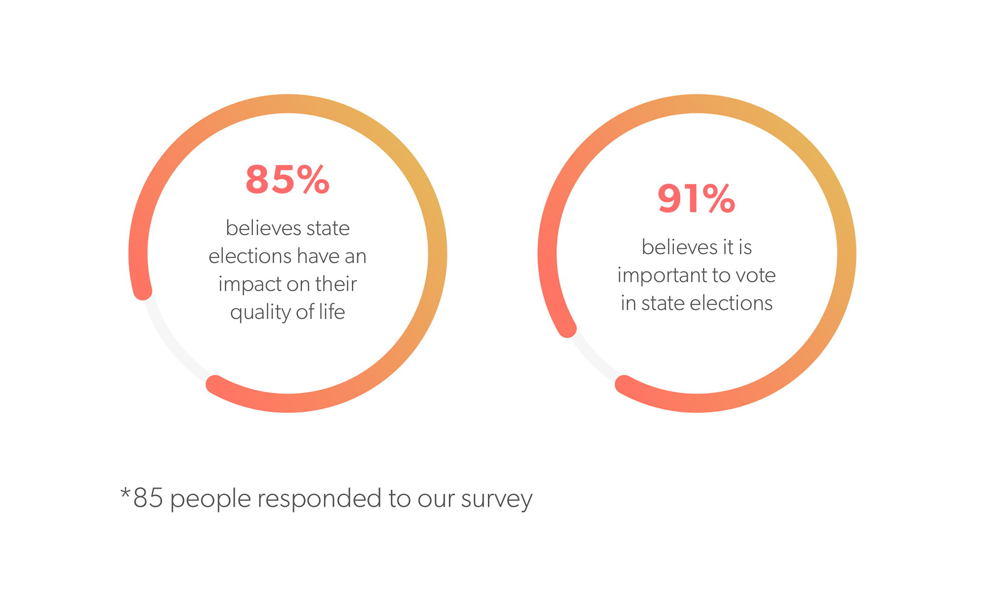
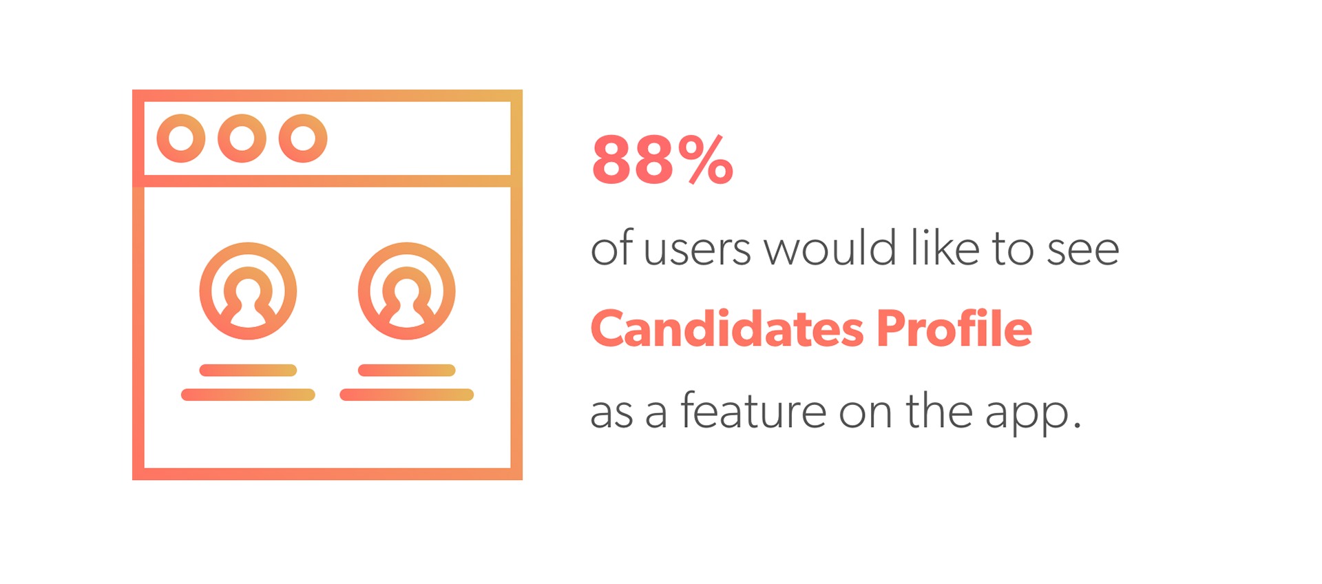
User Survey
To get some quantitative data from our potential users, we conduct a survey on Google Forms and recruited participants via Social Media and different Slack Channels. Surveys helped us to determine what some of the main features should be on our mobile website.
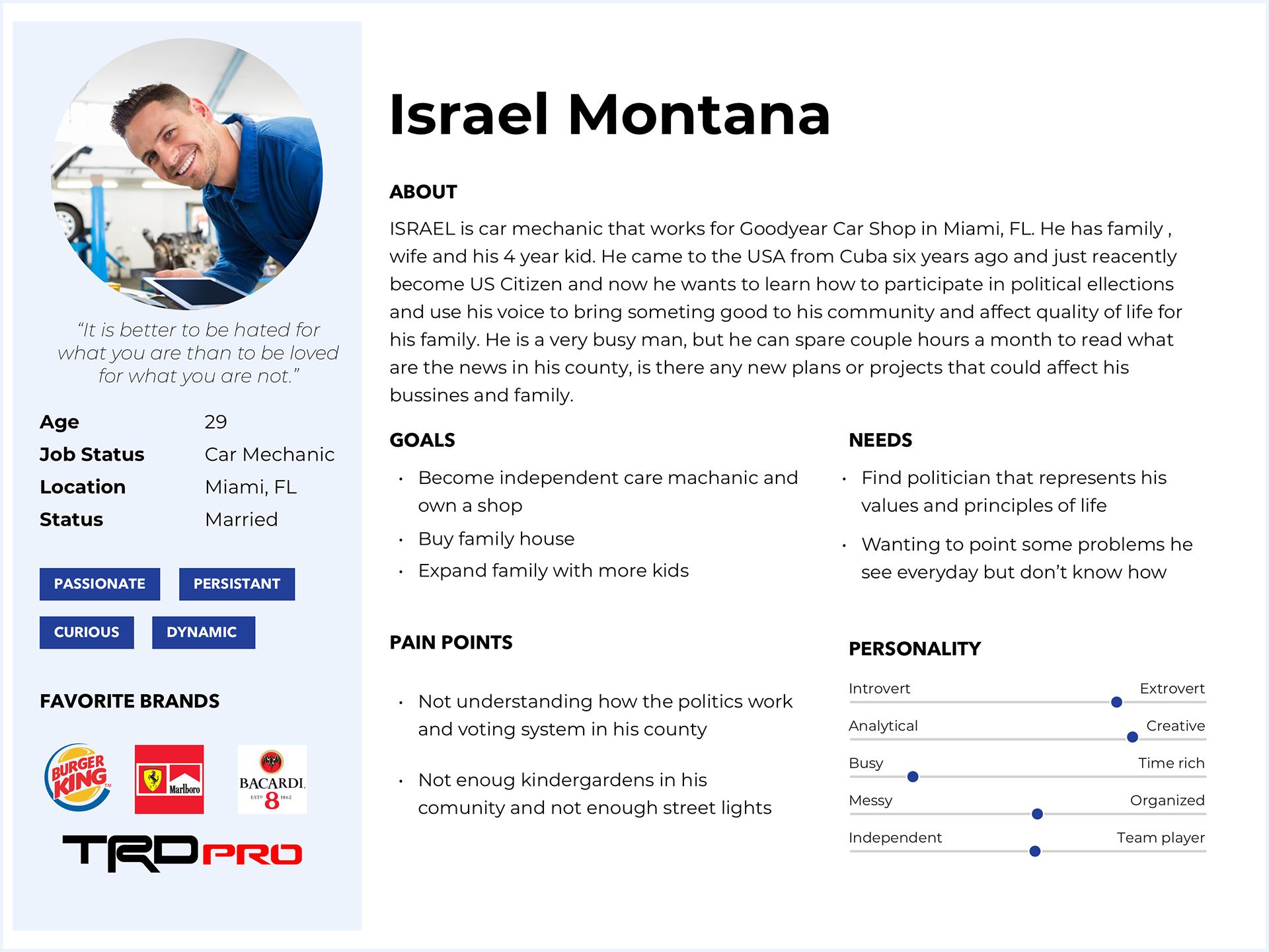
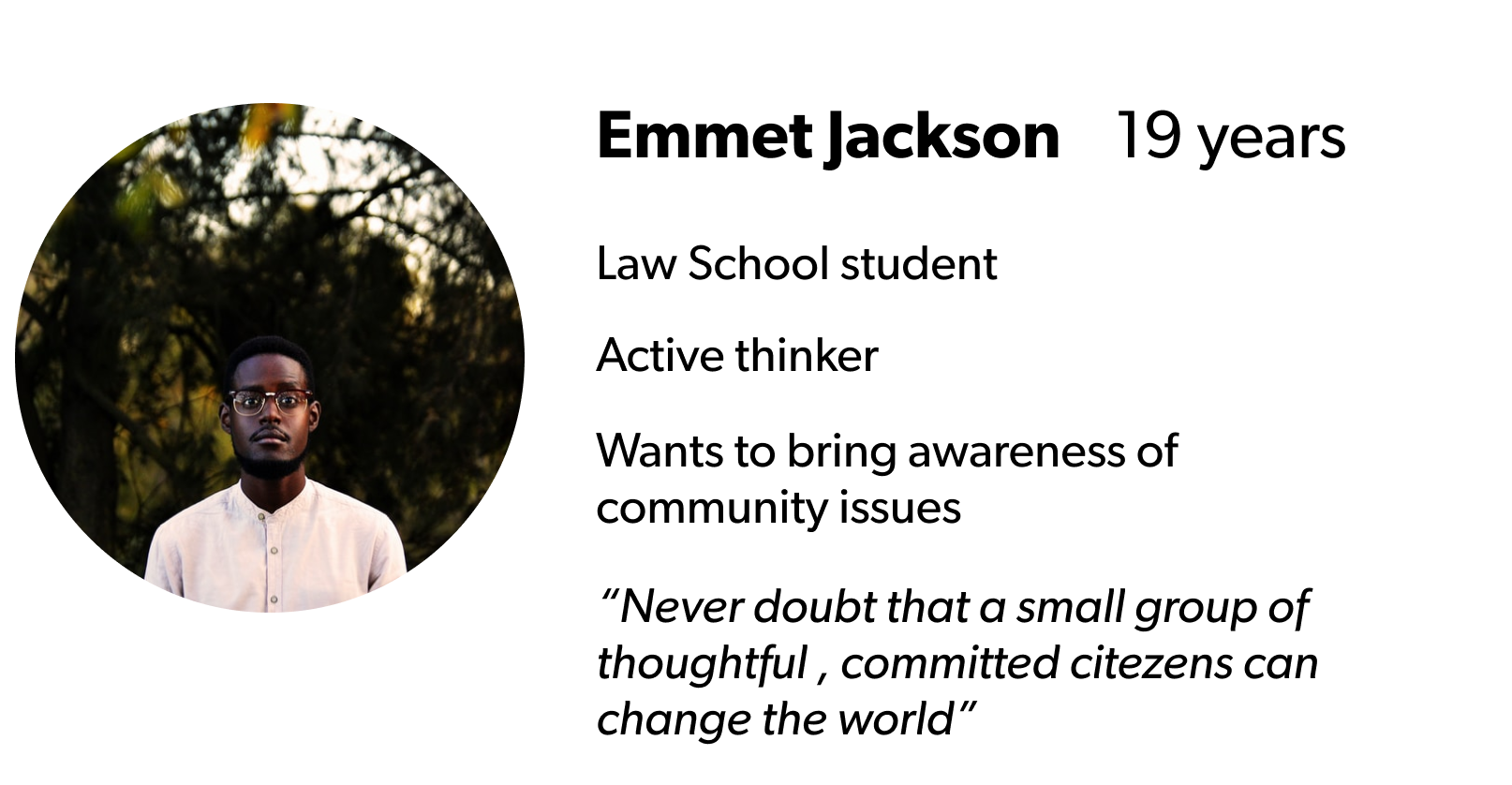
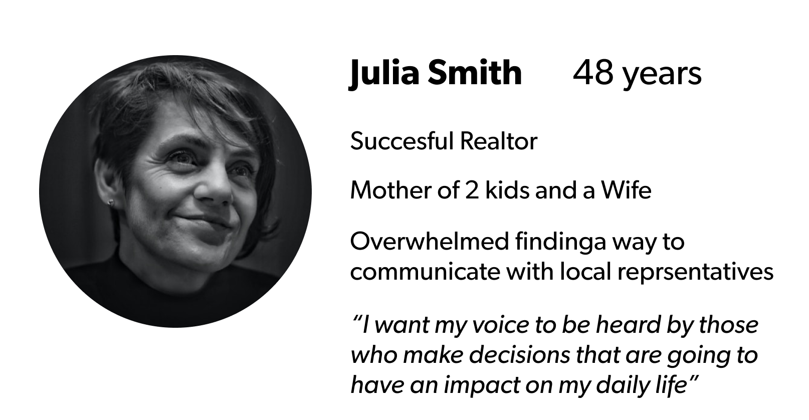
User Persona
Represents our target customers. It helps us stay focused on designing for external user in every moment of the design process.
We created 3 different personas that belonged to the three age groups.
Journey Mapping Session
User Journey map is a visual representation of the each step of user’s experience. During the Journey Mapping session our whole team met to gather ideas for the product features. For features we used Hyper Island Methodology. Goal was to understand users’ actions, empathize with their pain points and translate this into a list of features.
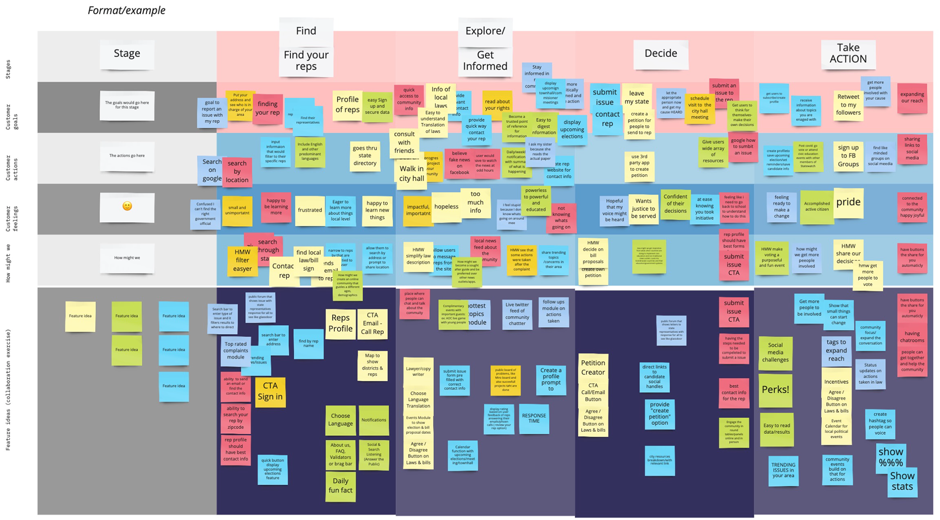
* created in Miro
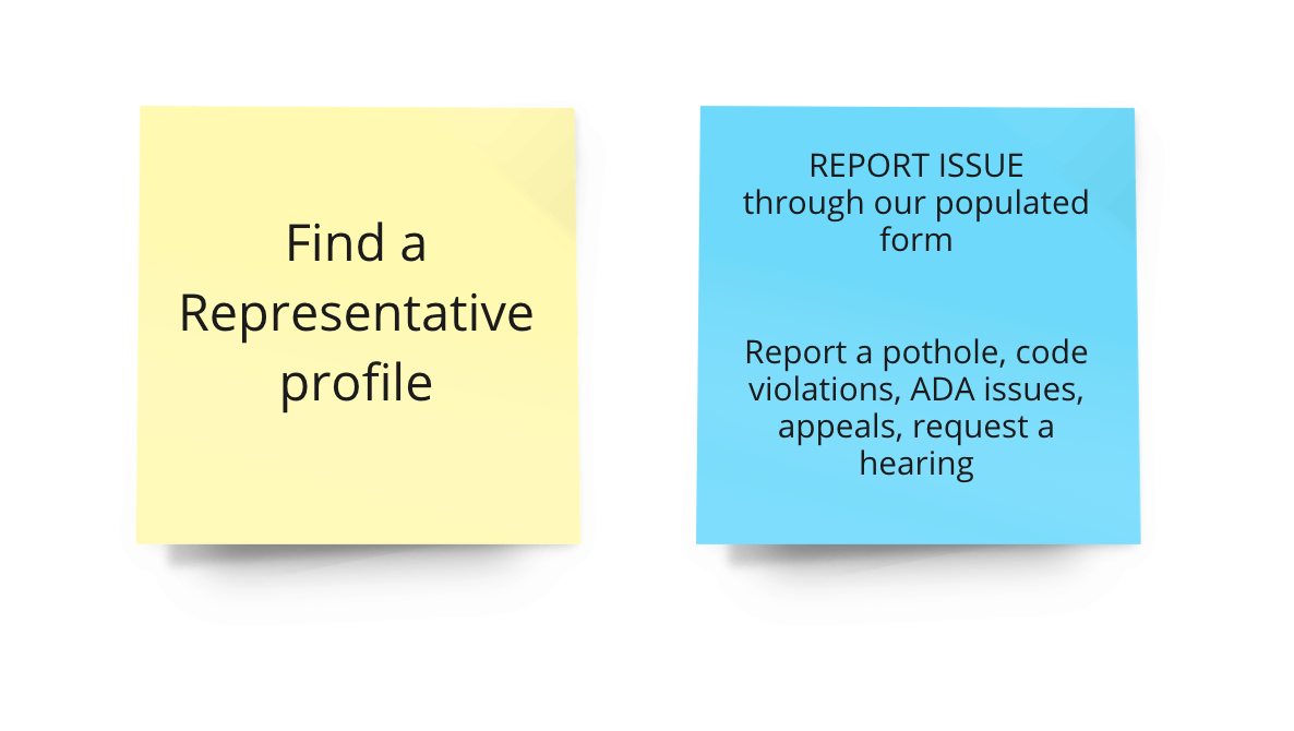
MVP Session
Later we prioritized our Minimum Viable Product using the MoSCoW prioritization method. We decided on our Must haves, Could haves, Should haves and Won't have. Two must haves were:
1. Find a Rep profile
2. Report Issue

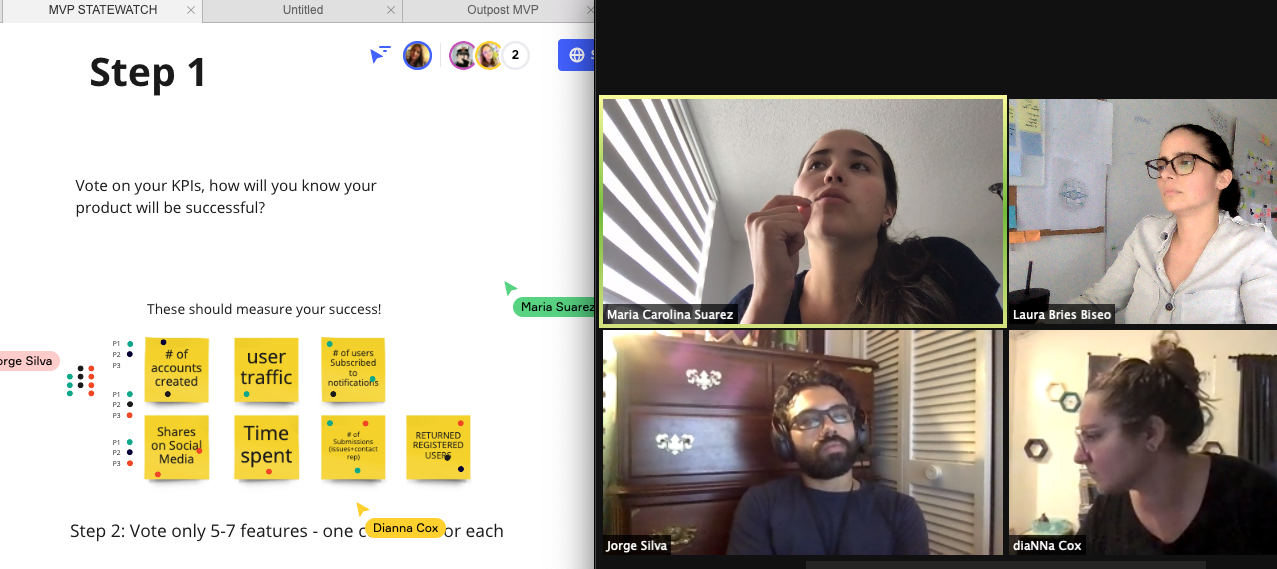
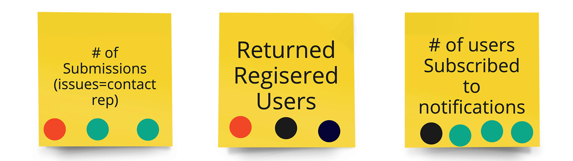
KPI Session
We met again with the web development part of the team to define what our KPIs are.
Key Performance Indicators are measurable goals that allow us to judge our success when launching a digital product. The three main KPIs that we got as result were:
1. Number of Submissions (issues or messages to representatives)
2. Returned Registered Users
3. Number of Users subscribed to the notifications
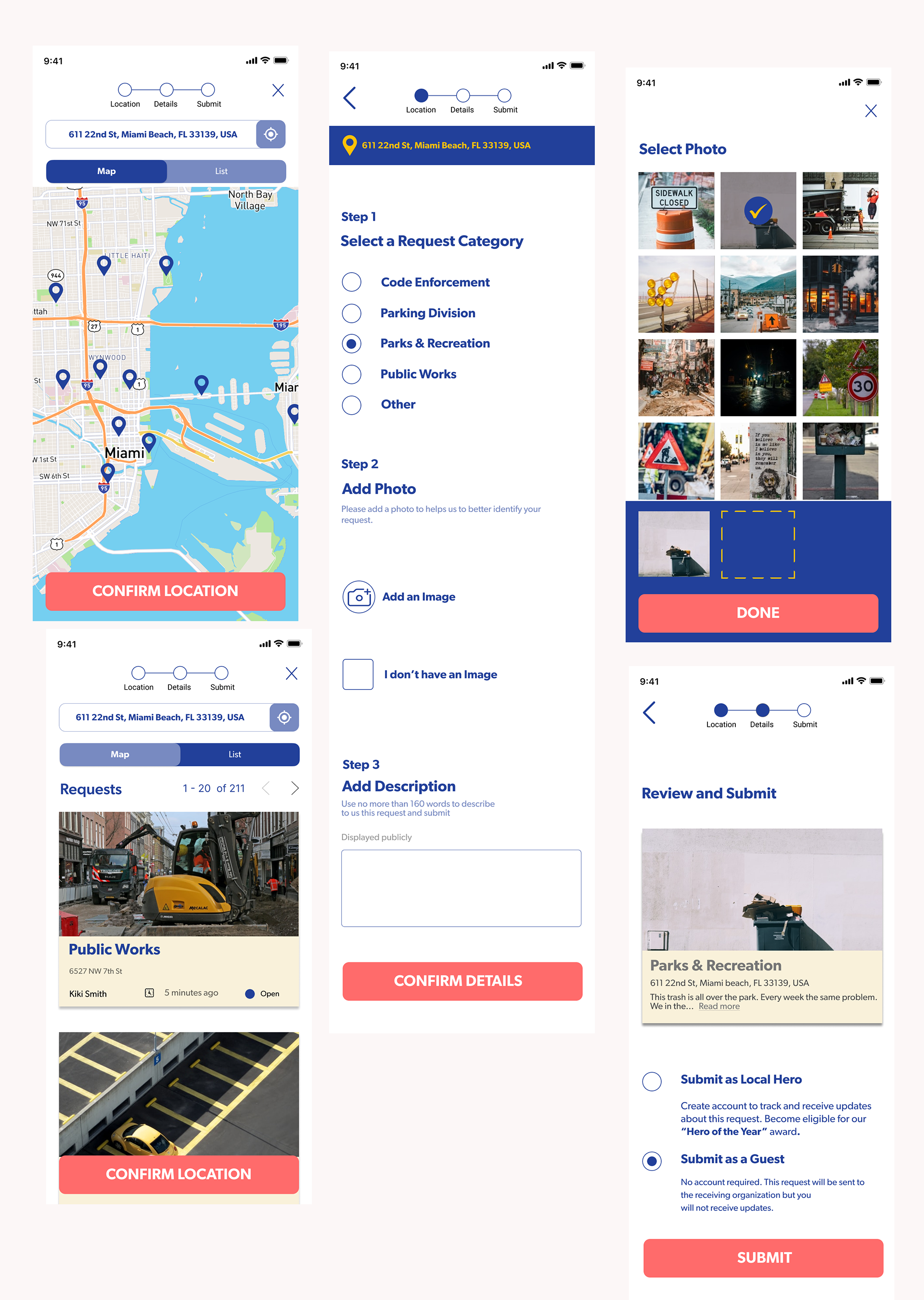
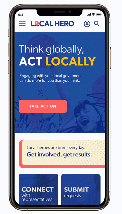
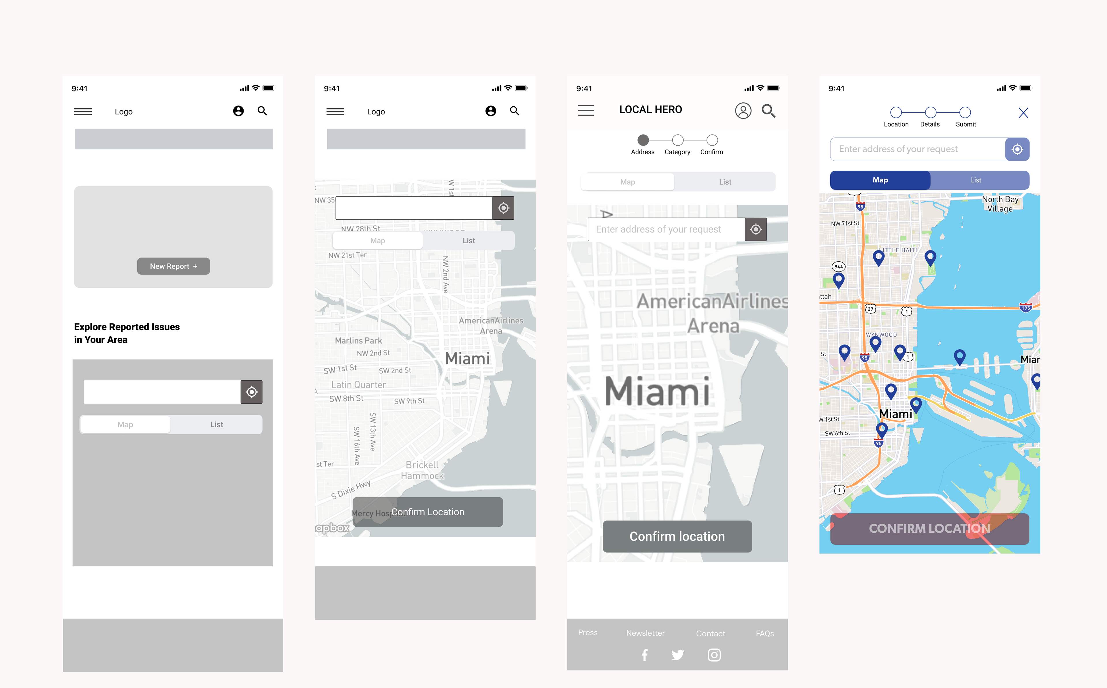
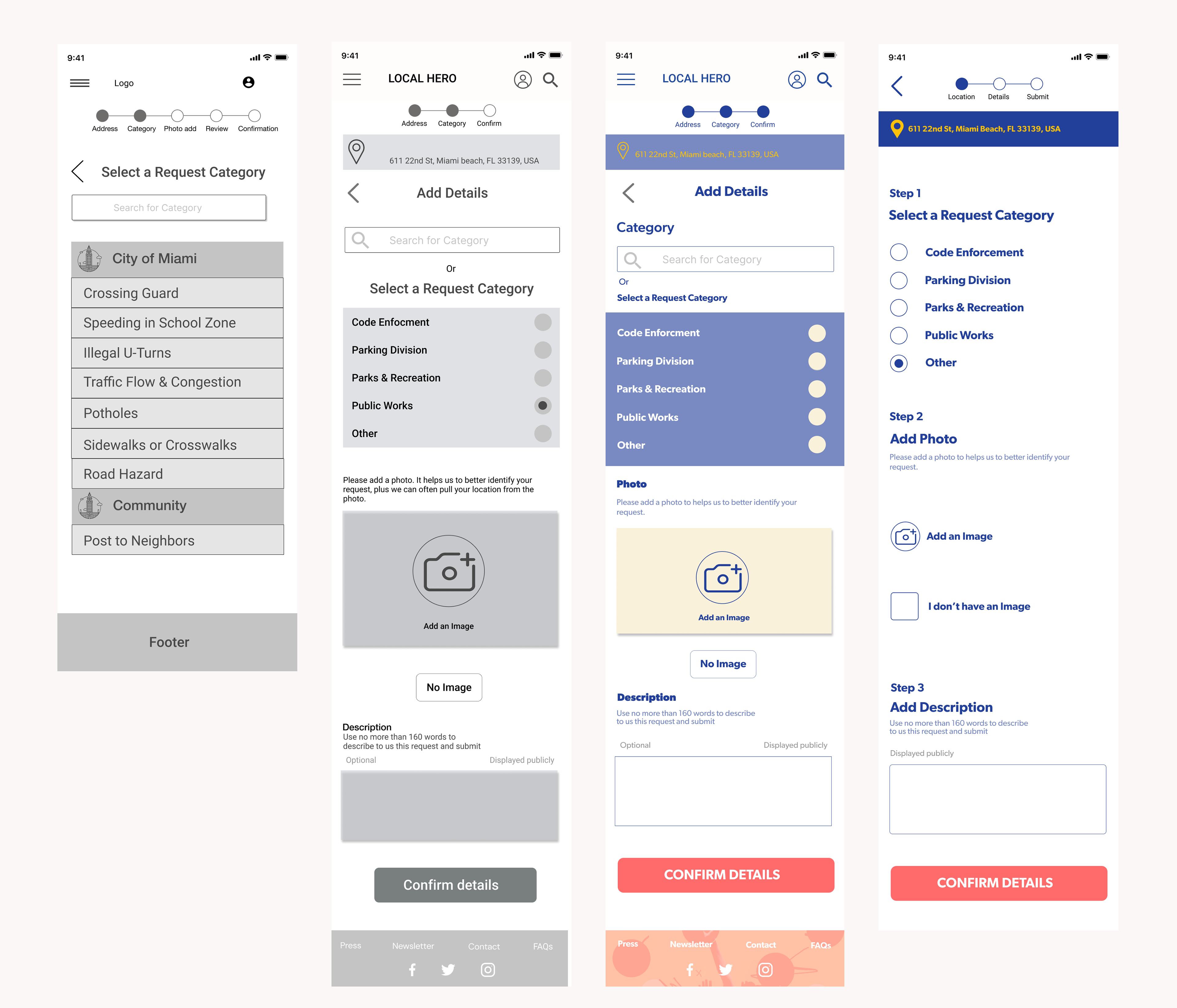
Flows
It was time to create paths that user will follow in order to complete a task.
On the right you can see " Submit my request flow" that was feature that I was designing.

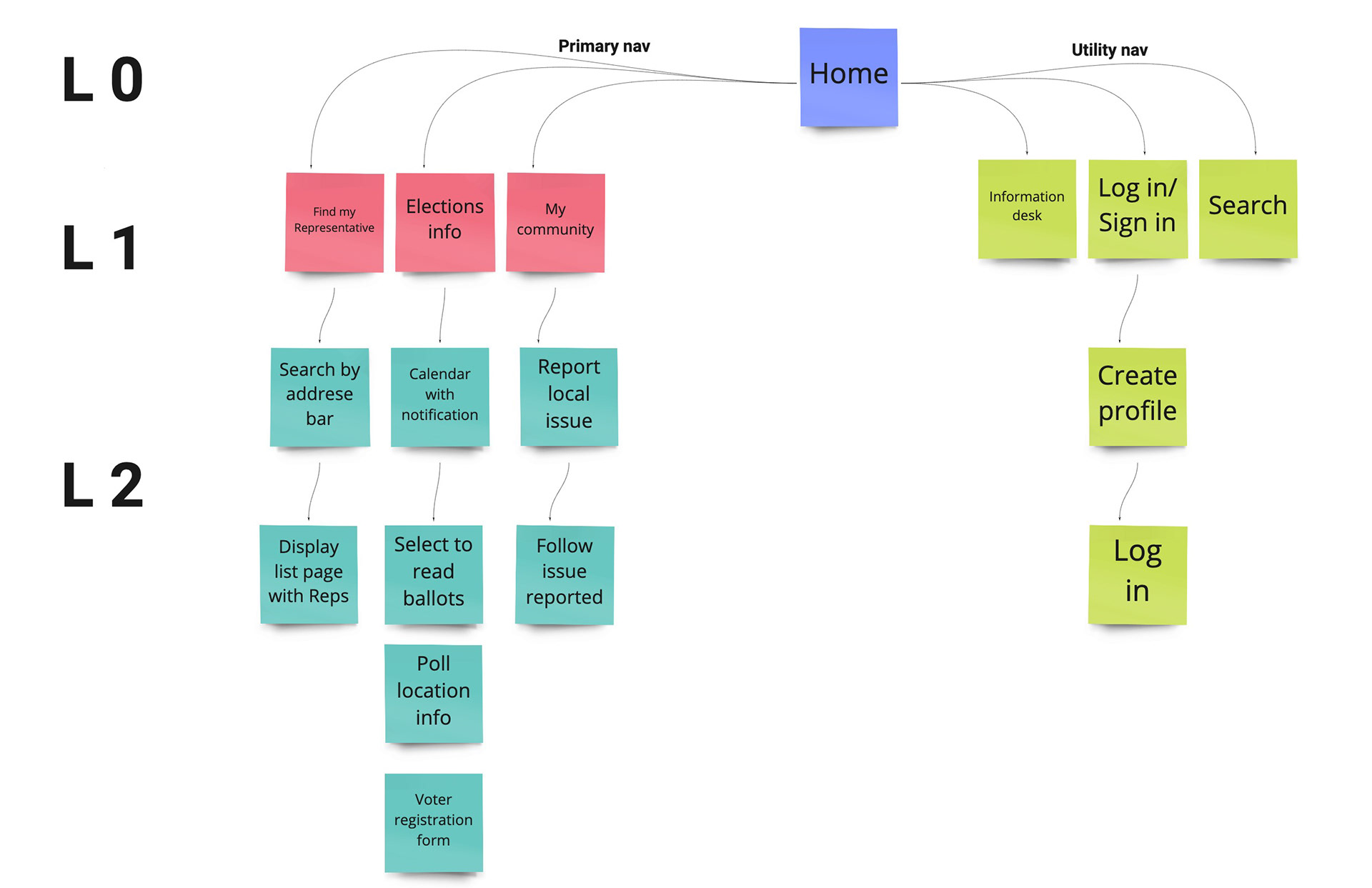
Low Fi Sitemap
With the list of features in mind we created information architecture of our website. Started simple with Lo Fi to Hi Fi sitemaps.
* Created in Miro
Hi-Fi Sitemap

* created in Sketch

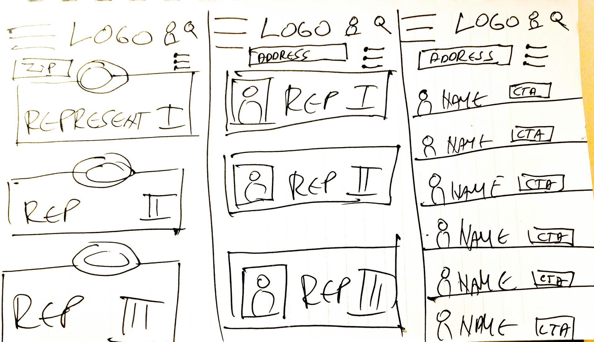
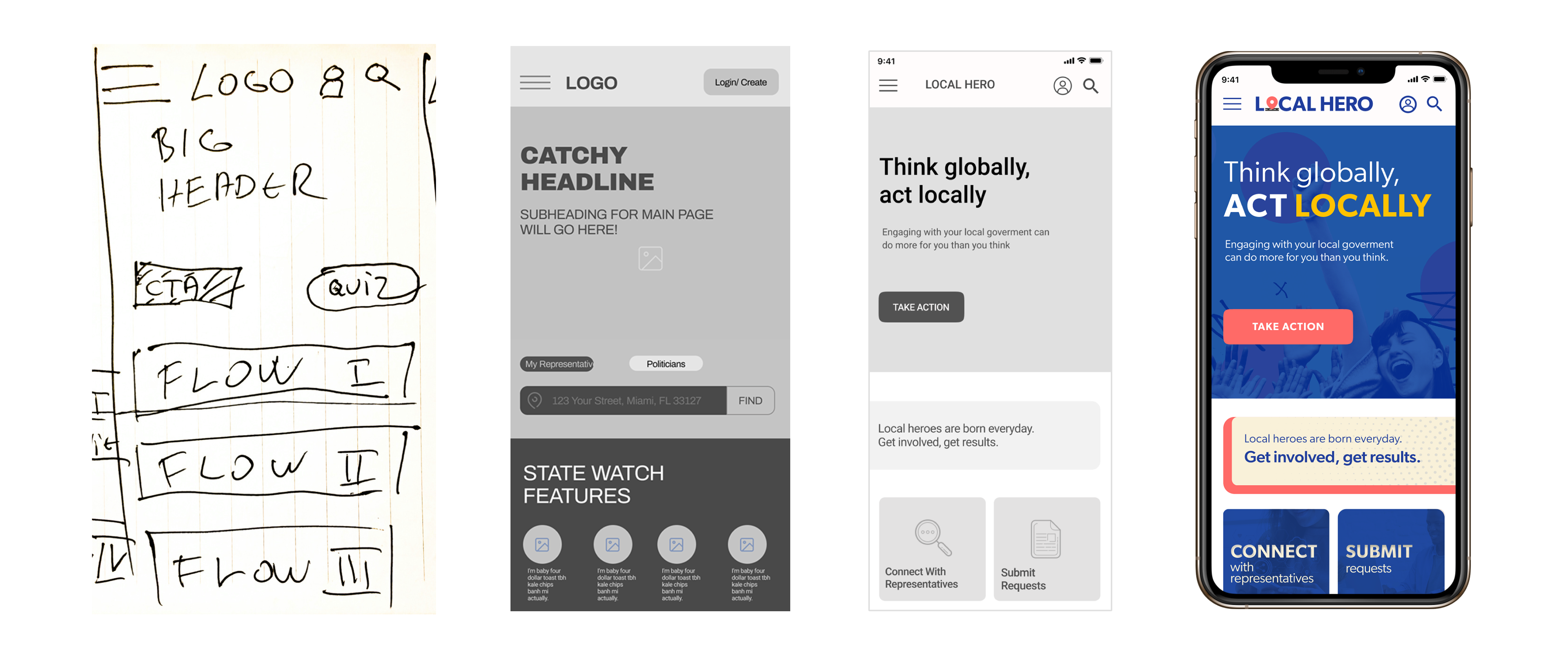
Hand Drawn Sketches
Are great way to present and test many early ideas, saving time and money. They are also valuable guide to move into the Wireframes.
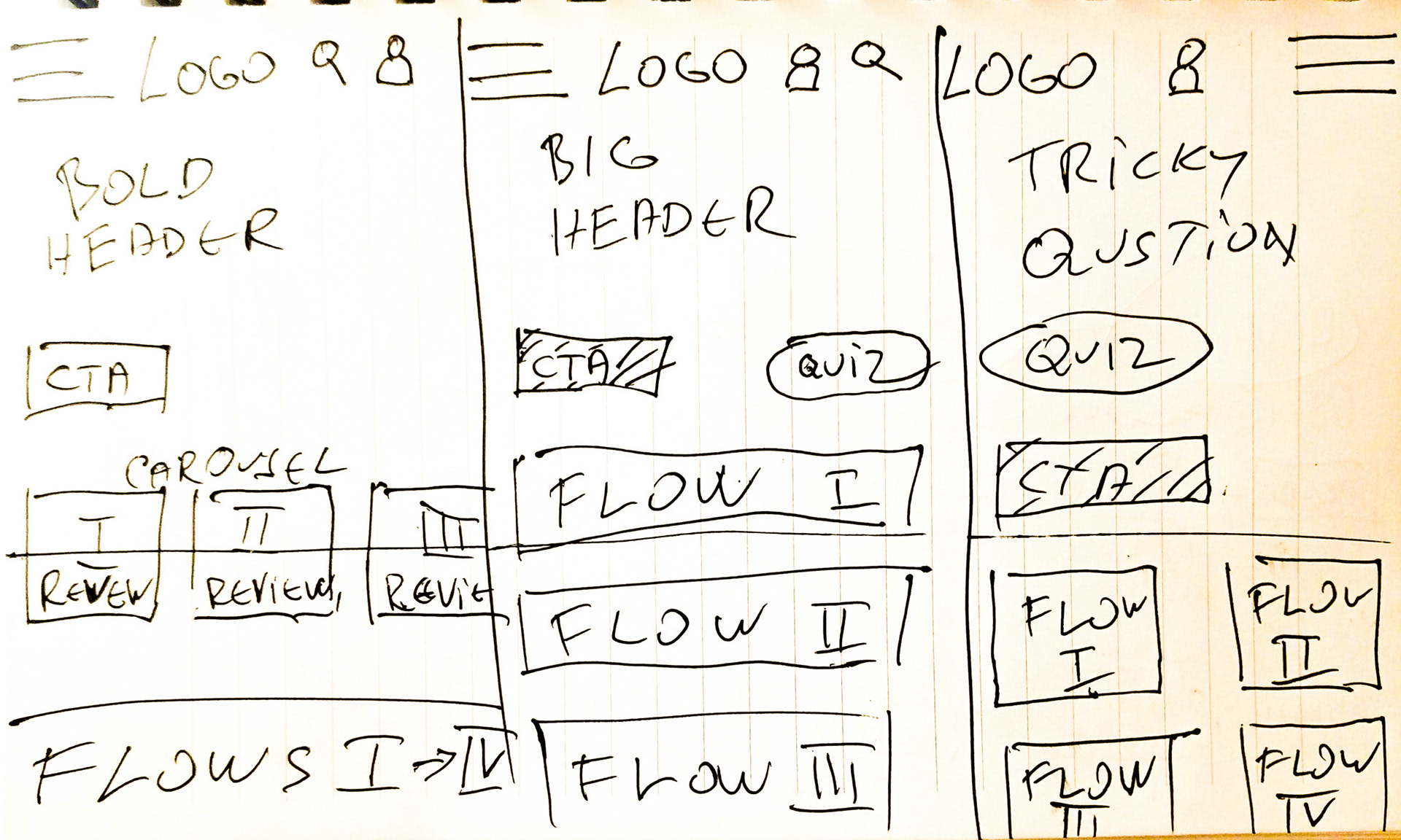
Wireframes
It was time to move from pen and paper to the big league of Figma Wireframes.
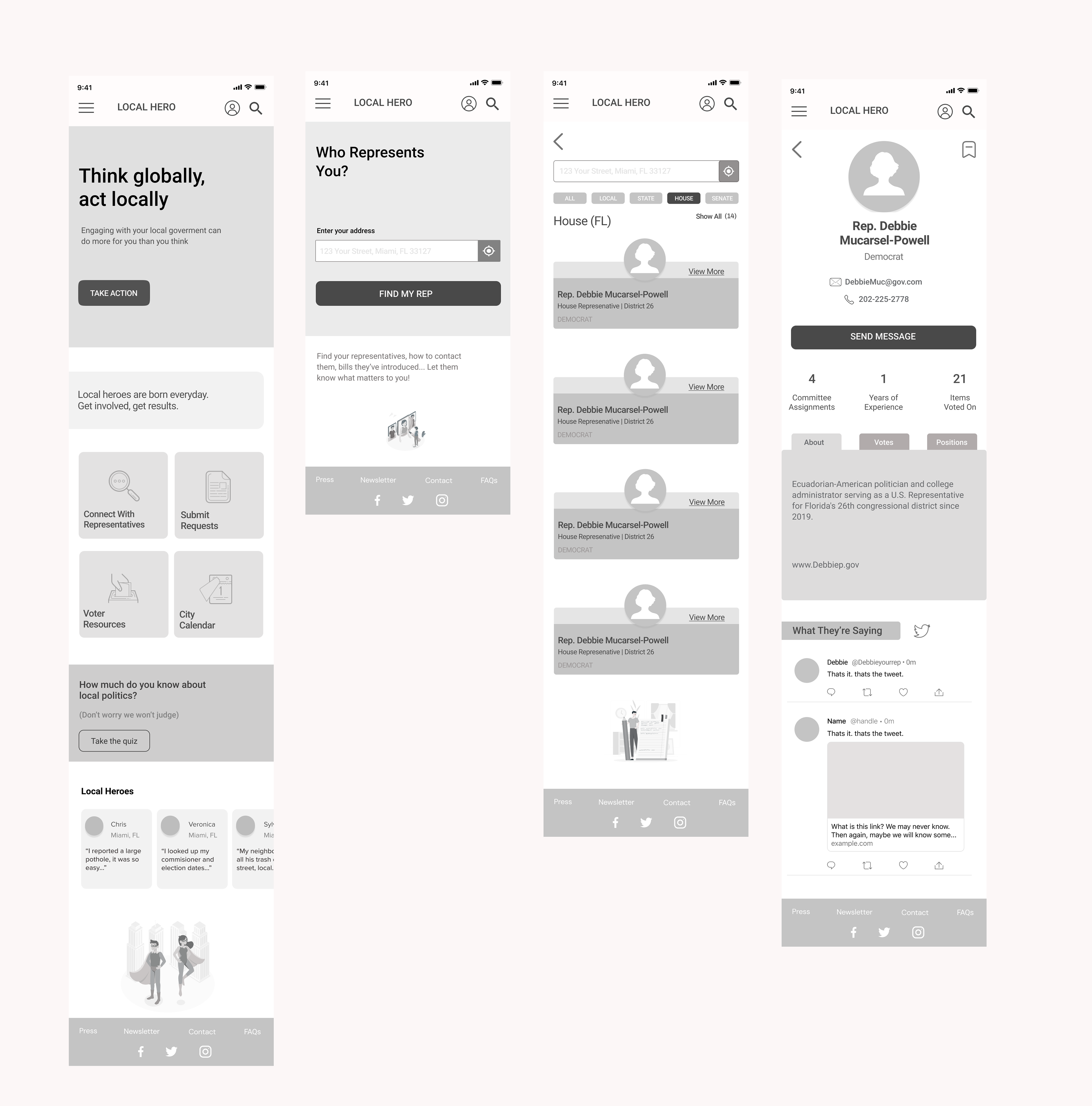
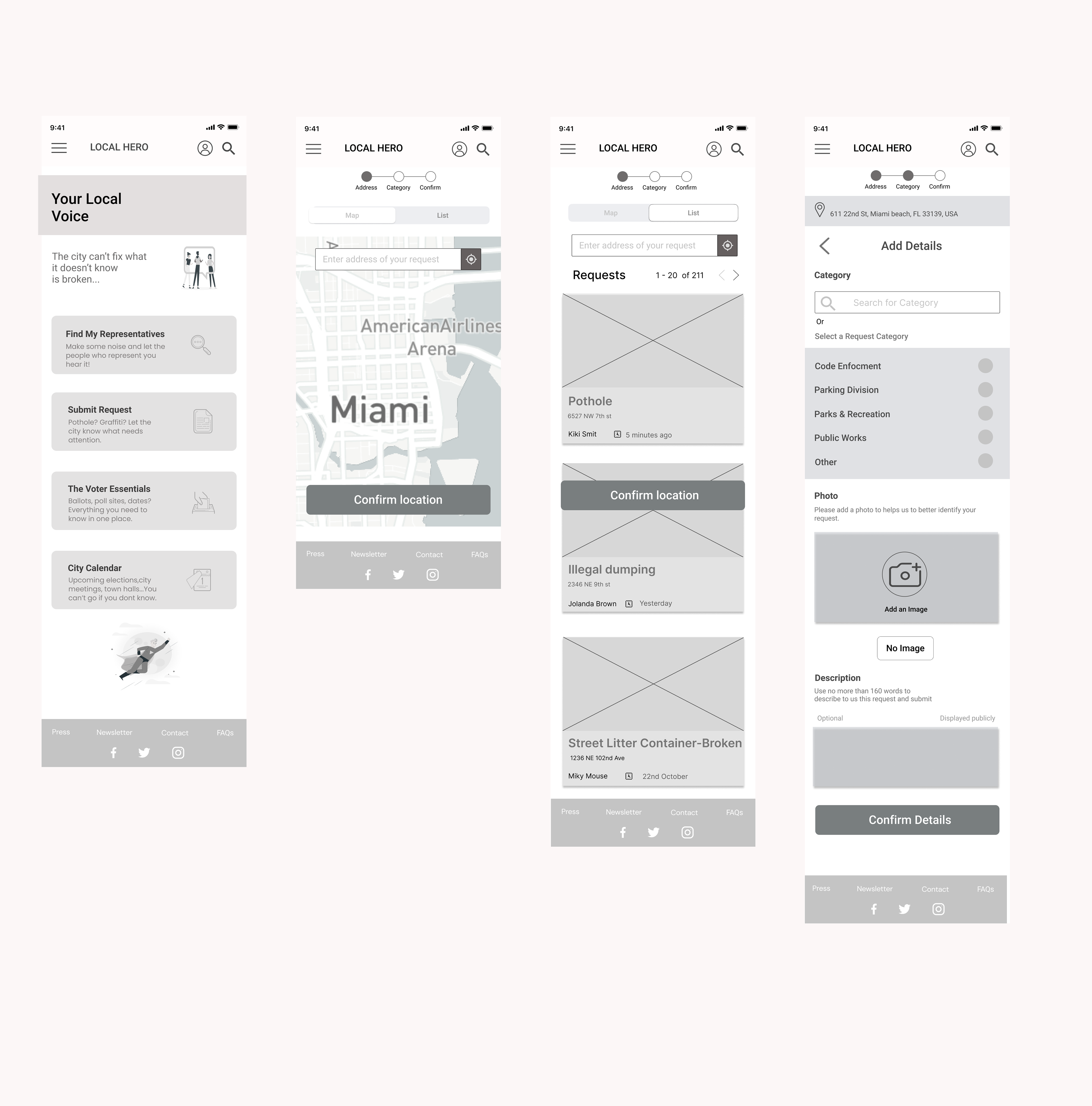
* created in Figma
We created Wireframes Prototype and user tested it. After that we did more wireframes.

*Wireframes prototype in Figma
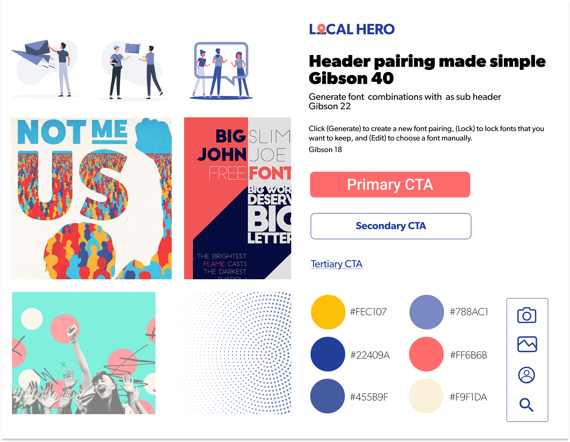
Mood Board
Before we moved on to High - Fidelity prototype we create our style guide.
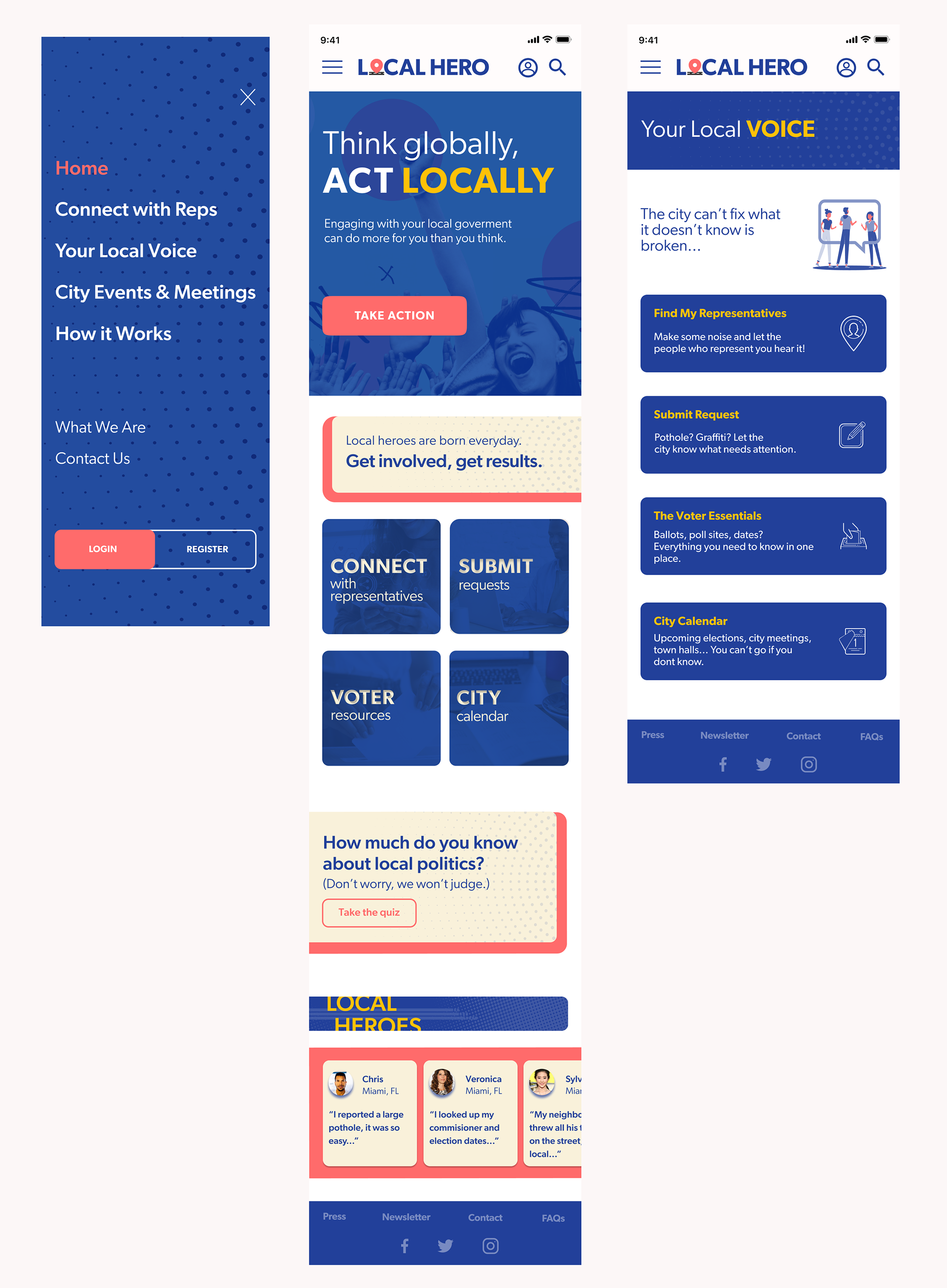
Mockups
The fun part where we "gave life" to our Wireframes.
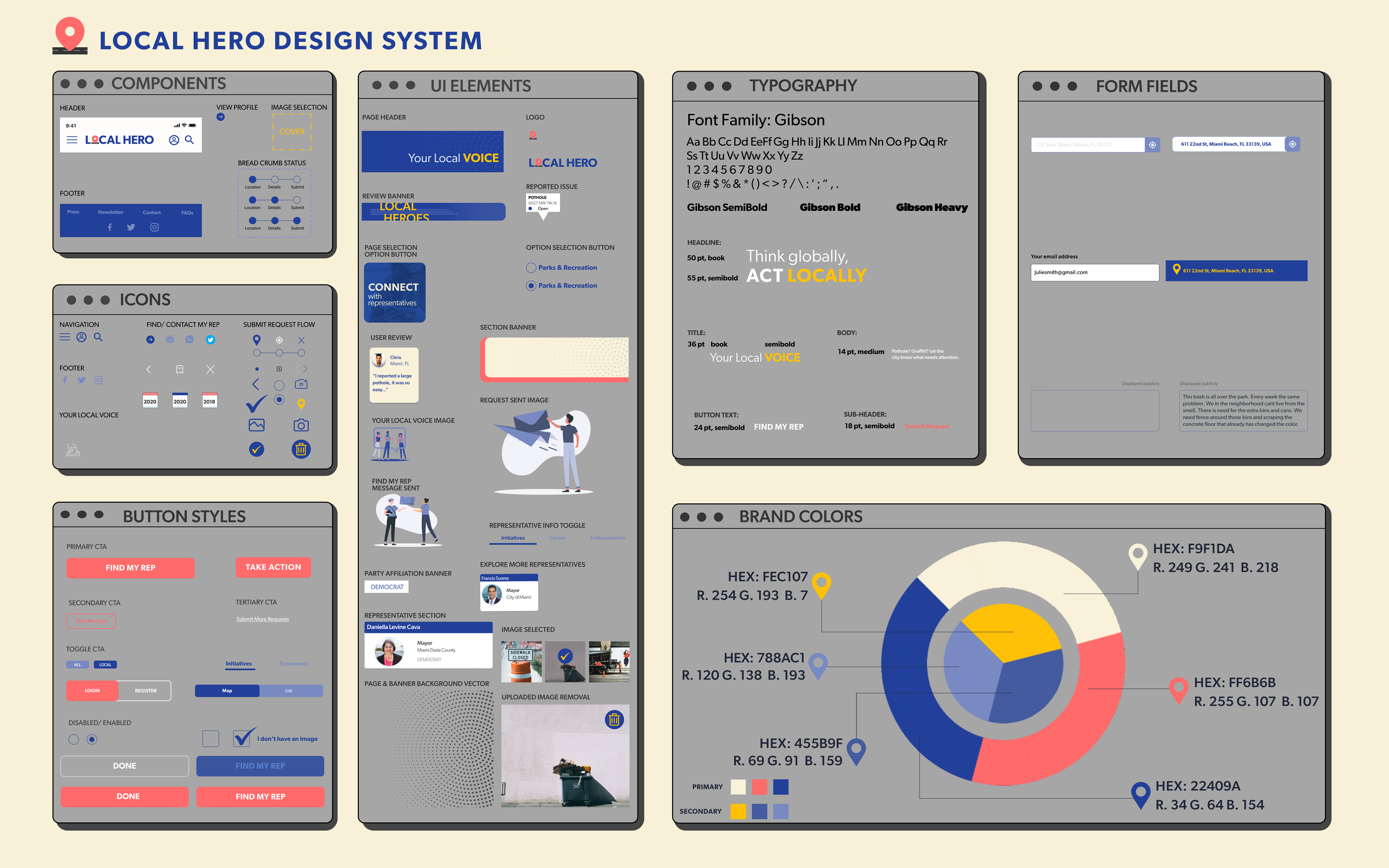
Design System Manager
We made set of components that create a consistent interaction with our product.
Design Decisions
IXD - Interaction Design
Micro-interactions in our mobile website.
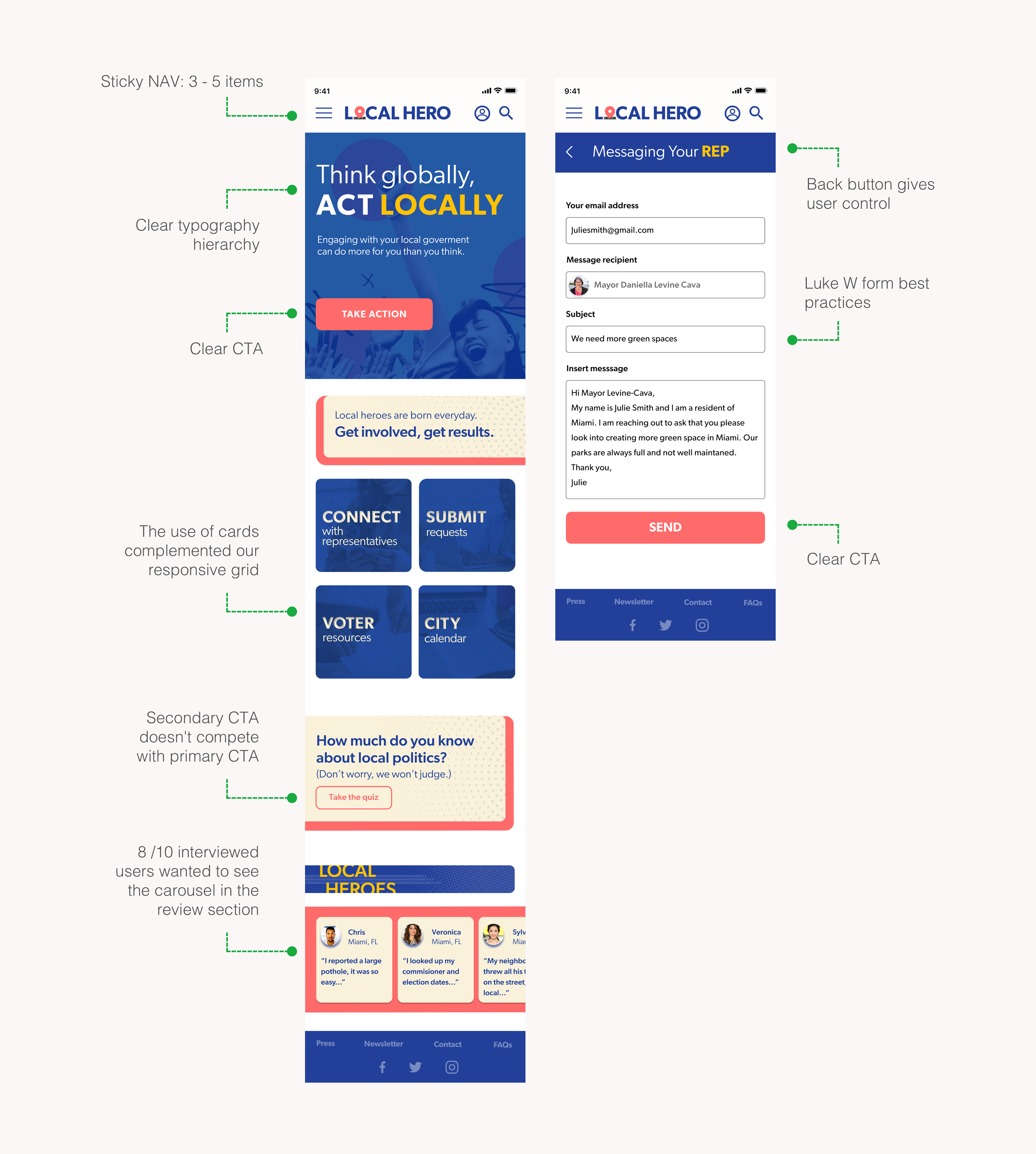
Hamburger Menu
Overlay with clear hierarchy
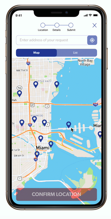
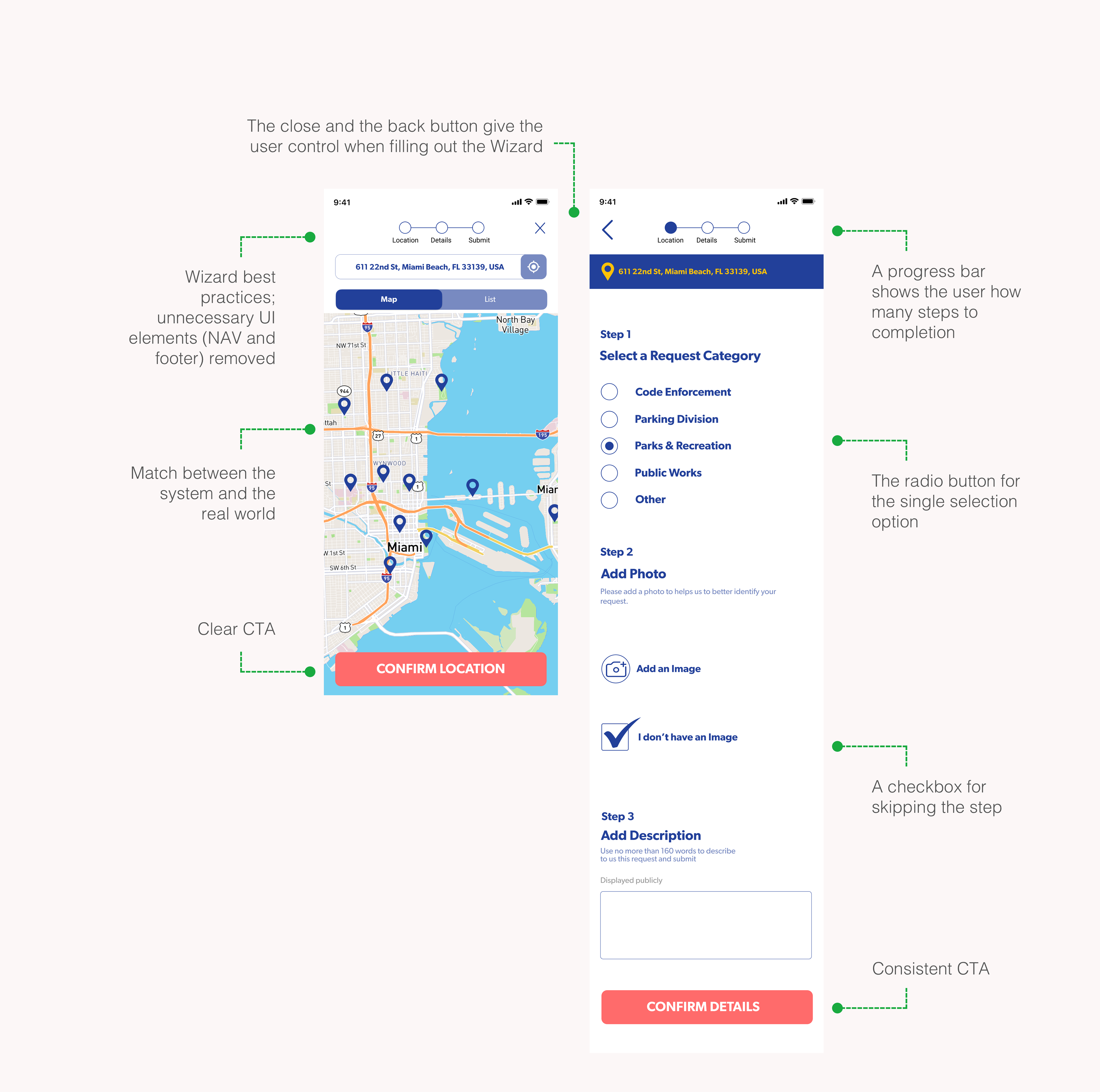
Map View
The interactive map helps users navigate their area in relation to city they live in.
Radio Button
The radio button transition is a unique touch that shows a system response.

We connected our high-fidelity mockups and created a prototype. Doing testing fully online was challenging but we found creative ways to make it successful.
A/B Testings
9/10 users we tested said they like option B (image on the right) more.

Mockup Prototype Test
We got great feedback, that we were able to apply before handoff to the Web Develop Team.

Evolution of the Home Page
Iterations on Map View Page
Evolution of Details Page
Just some of the iterations this page went thru.
Handoff
We met with web developers to walk them through everything that we prepared step by step. Figma is an amazing tool where they could find CSS code for the style of the web page.
Good communication with the web development part of the team and a well-organized hand-off is needed for a successful launch. In this phase, we provide assets, flows, and annotations to make sure that what is built replicates what was designed.
Good communication with the web development part of the team and a well-organized hand-off is needed for a successful launch. In this phase, we provide assets, flows, and annotations to make sure that what is built replicates what was designed.
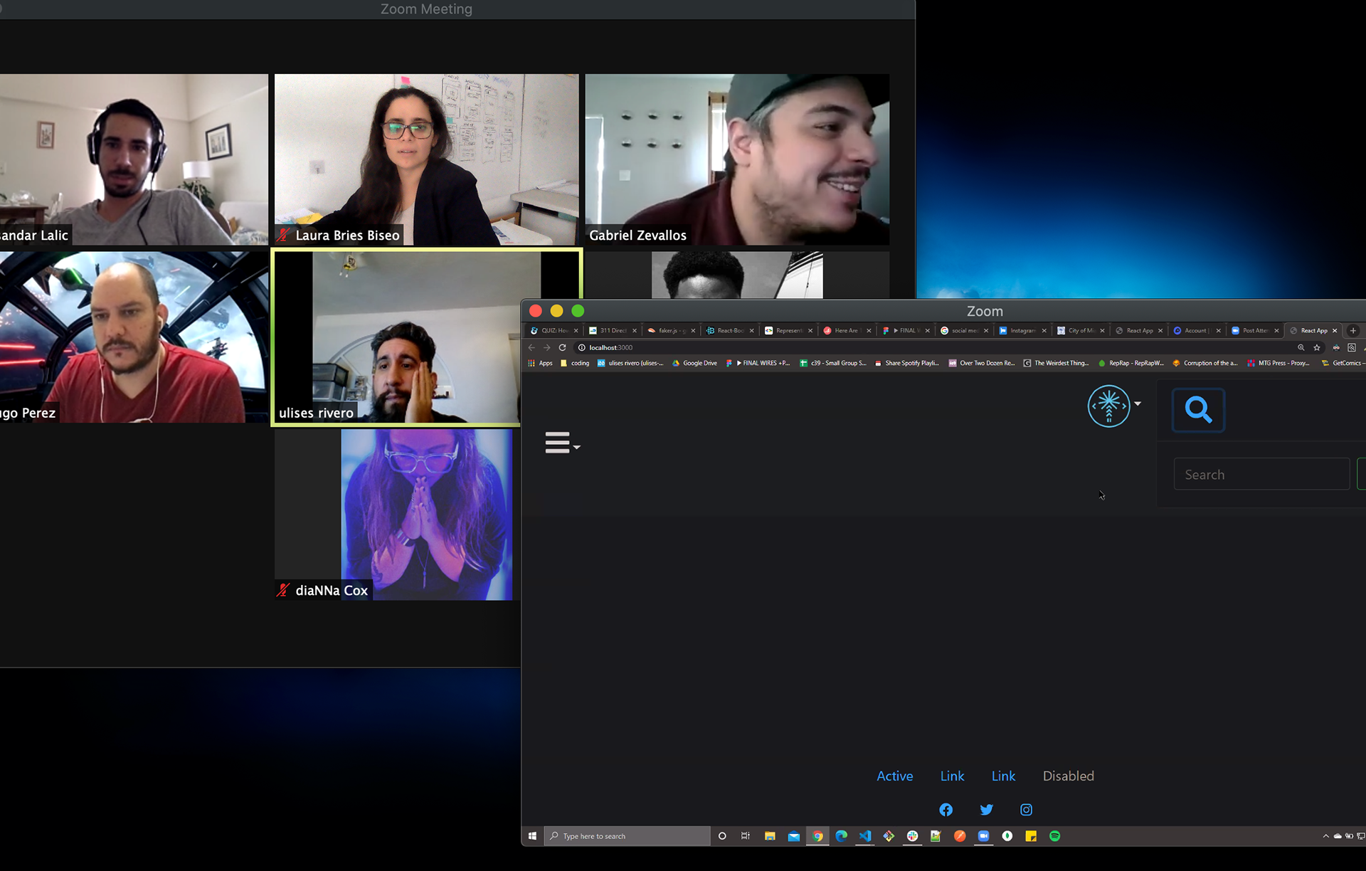

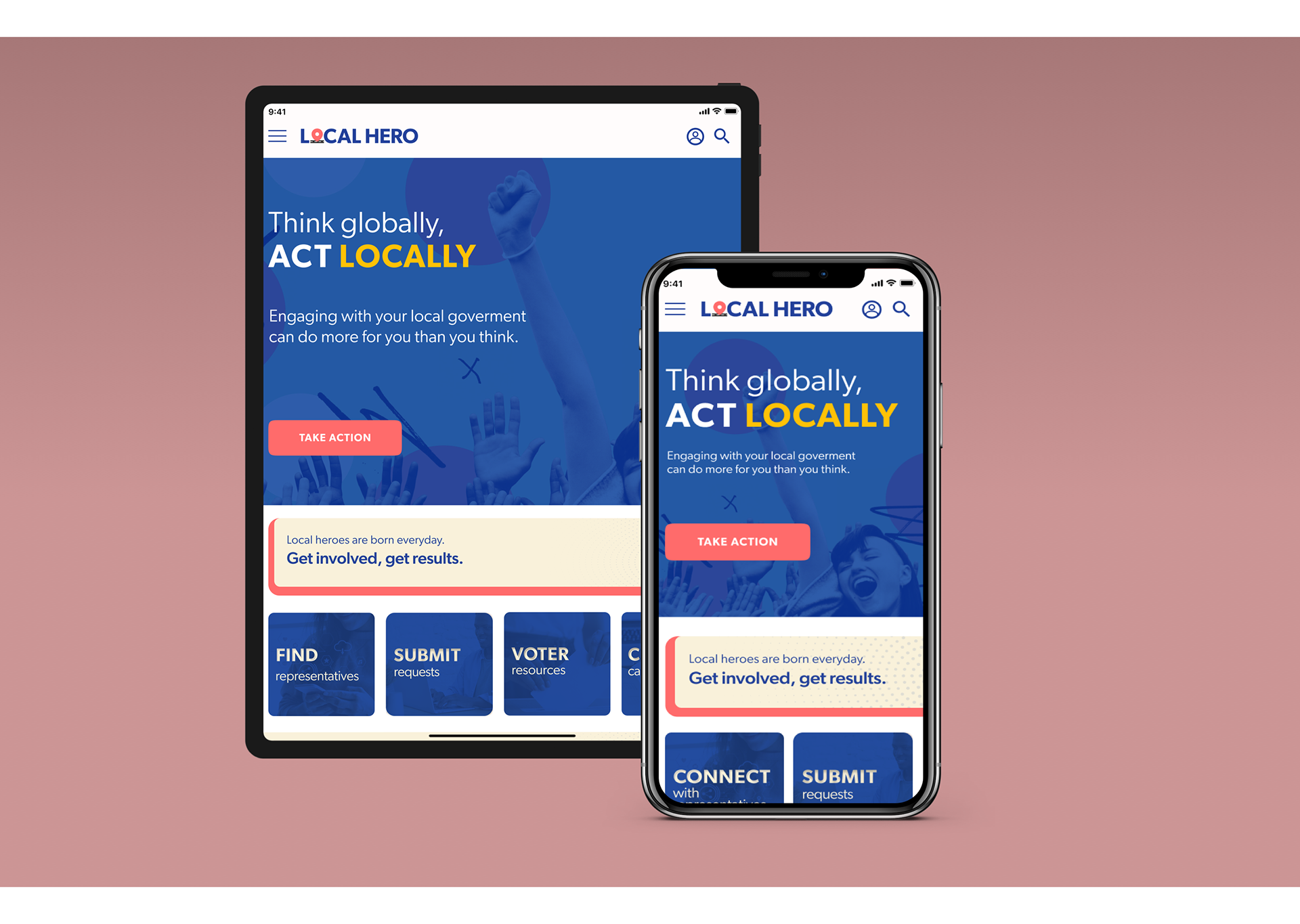
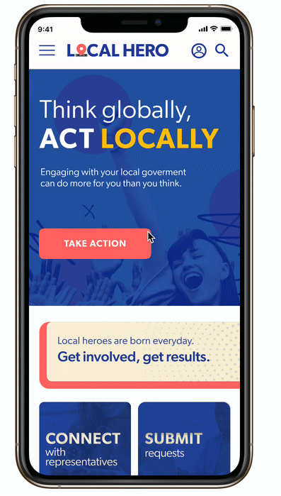
Final Product from our Web Development Team

What is next?
Next steps are to continue collecting data, implementing feedback and design/develop new features that will improve user experience.
